Rory from Earthly Comforts is pretty cool guy and when he inquired if I would like to work with him on designing a new business logo I jumped at the chance. I’ve always enjoyed collaboration projects. There is something special about working together on an artistic project. The end result is something that would have never come to be without the diverse input from both parties.
The brief was 1) keep the overall color scheme of the original logo (burgundy, orange, dark green) 2) simplified but not too serious (open to animated/cartoon imagery) 3) Should include “Earthly Comforts”, the company name on top and “Town Gardeners”/“Town Gardening Services” at the bottom.
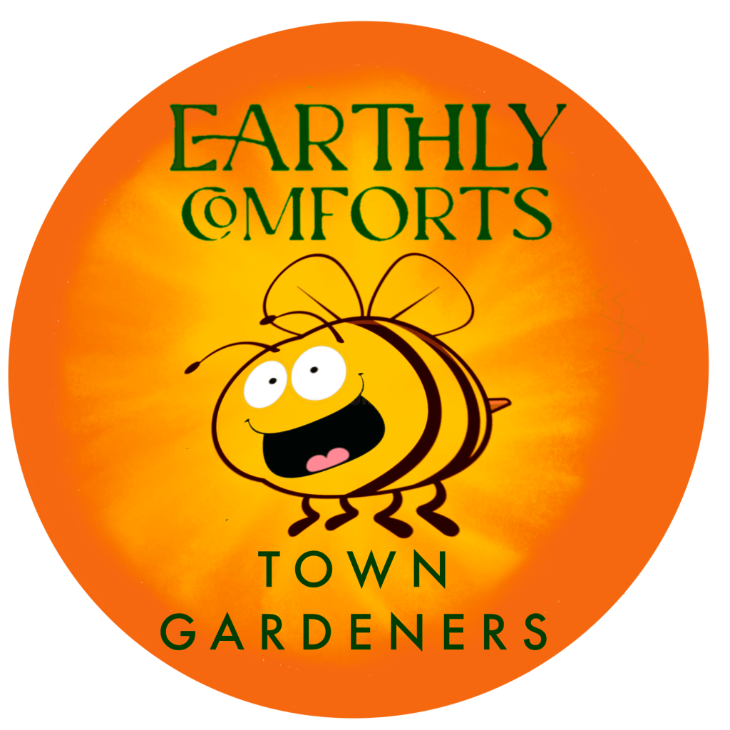
The original logo and the one that will remain Rory’s main logo for his blog is this:

Rory also provided me a couple images for inspirational reference:


My first (and failed) draft attempt played off the cartoon planter, while adapting it to the design brief:

With this design in hand, Rory took some time to rethink what he wanted (which wasn’t the above, haha). He then sent me the below image he created using AI as an additional reference:

To be honest, I really liked the elements of this AI design and I decided one direction would be to work with it to make it better fit Rory’s brief direction. But I also thought it might be fun to play with a cartoon bee as bee’s are the ultimate gardeners. So I came up with the below images for Rory to consider:


With these designs I wanted to freshen up the orange circle. To give it more life and energy, like the sun. Rory and I also both loved the font of the AI generated image for “Earthly Comforts” so I lovingly borrowed that for these. My personal favorite was the bee with the flower. It’s playful. It’s got some “action” in the bee interacting with the flower, and I like how the flower breaks the circle up a little by extending beyond the circumference.
But Rory’s preference was for the flower and then the bee alone. These are a bit more simple, but still very vibrant. For the flower, I adopted the overall flower shape from the AI image but colored it burgundy (one of Rory’s colors), and added some highlights for pop.
So finally, with some additional polishing and clean-up we arrived at these logos. The flower to be his primary business logo and the bee to be used as an additional fun add-on where appropriate:

What do you think? The decision has been made by Rory, but I always love to get feedback. Also check out Rory’s perspective on the project here.
Be well,
Monty

The Bee is super cute. I preferred the Bee and the Flower.
LikeLiked by 1 person
Thanks!!🙏
LikeLike